Assignments > Project 1b: Second Deliverable
Due on Wed, 03/27 @ 11:59PM. 60 Points.
In your second deliverable, you will be converting your web page from a wireframe to a fully designed website in a style of your choice. Please read the following guidelines carefully. I have also included a list of useful tools / websites that can help you below:
Useful Tools / Websites
Images and Videos
For stock, uncopyrighted images and videos, try:
Color Tools
To find colors for your site, try these websites:
Fonts & Icons
1. Set Up
Make a copy of your project01a folder. Rename it to project01b
- Tip: Make sure you close out of all your
project01afiles in VS Code so you don’t accidentally edit the wrong files.
2. Your Tasks
Please complete the tasks listed below:
2.1. Font Choices
Select the fonts you will use, and apply them to your various HTML elements using CSS.
- You must have 2 distinct fonts – one for your headings (h1, h2, h3), and one for the
bodytag. - One of your fonts (probably the header font) must be a Google Font:
- If you don’t remember how to do this, refer to the 02-12 Lecture video around minute 33:00.
- Alternatively, you could also use an external font from another website (Font Squirrel, DaFont, etc.). There are probably video tutorials out there that provide guidance.
- Consider whether and how additional CSS font and text properties can also be used to create contrast and enhance usability. Check out the Course Reference for ideas (or google it).
2.2. Color Choices
Choose a set of compatible colors (typically no more than 5 unless you have a good rationale for doing so) for your visual design. Feel free to use the color tools above to help you create a palette.
- Once you have selected these colors, use them to style background elements, font colors, etc.
2.3. Media Choices
Media files are one of the best ways to add visual interest to your page. Consider adding some if it makes sense for your webpage.
- If you don’t have your own images, feel free to use the stock image / video websites above to download images.
2.4. Composition Choices
Make sure that you’re thinking about the principles of composition (proximity, alignment, contrast, asymmetry, color, and repetition) to build hierarchy and enhance usability. Feel free to revisit the slides under Topic 6. Some questions to ask yourself:
- Are related content / ideas grouped together?
- Is there sufficient padding / whitespace around my different groupings?
- Is color being used effectively.
- Are the fonts I’ve chosen readable? Are they helping the overall look-and-feel of the design?
- How am I creating contrast?
- How am I creating visual interest in my design?
- What values am I communicating?
2.5. CSS Flourishes
Use at least 1 advanced CSS technique from Topic 8. Possible options include:
- Adding some background image effects or filters
- Adding a transition that gets triggered when the user hovers over an element or clicks on an element
- Adding a keyframe animation
You may want to follow a YouTube tutorial if you’re curious about implementing a particular effect. There are so many different ways to use transitions / keyframes to do interesting things.
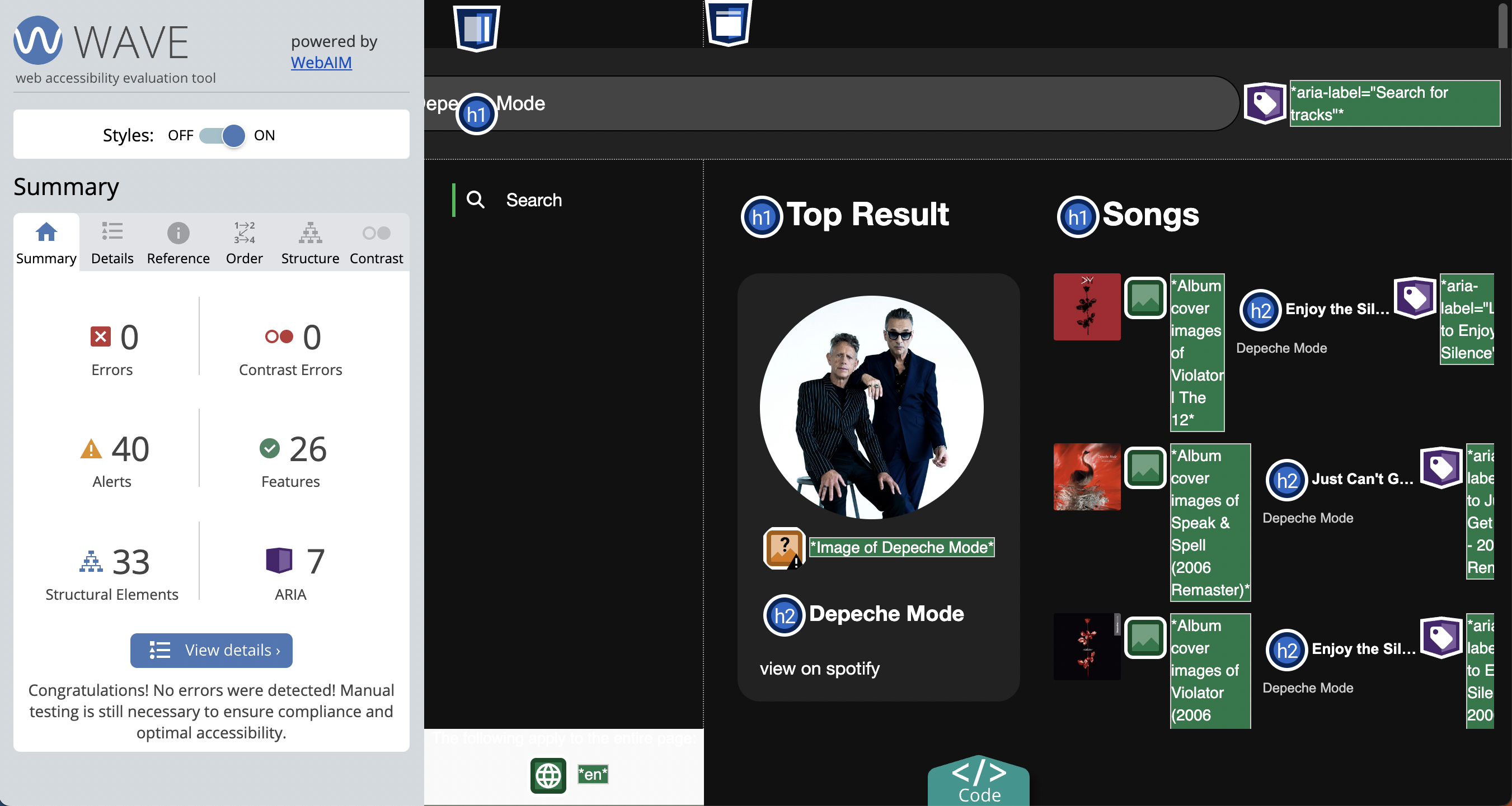
2.6. Accessibility
Use the Wave Accessibility tool to generate a Wave report. Then, fix any accessibility errors that the tool identified until no errors remain. Then, take a screenshot of your Wave Report (see Sarah’s example below).
2.7. Reflection
Please briefly answer the following questions (just 2-3 sentences per question) in the textarea on the Moodle:
- How did you try to follow the principles of composition in your design?
- What are you most proud of?
- If you had more time, how would you enhance your current design?
2.8. Link to your Homepage
When you’re done, update your homepage (that you made during Tutorial 3) by adding a link to the index.html page that you just made (for Project 1b).
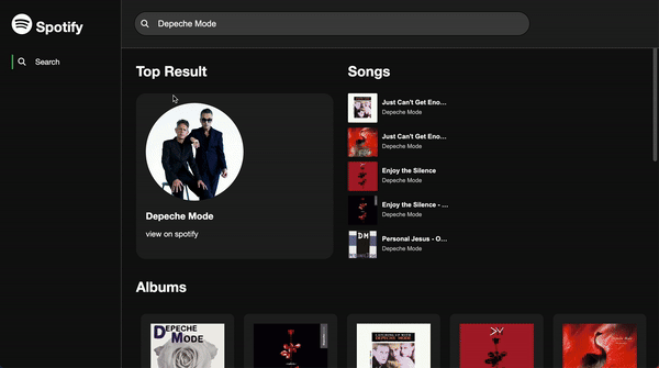
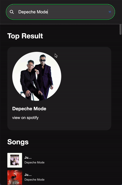
Sample
Sample Desktop Layout (Finished)
Sample Mobile Layout (Finished)
Wave Report (Accessibility)
3. Rubric
Before you submit your project, please check to make sure you have completed all of the tasks:
- [5pts] You have implemented 2 different font families
- [5pts] You have made thoughtful color choices
- [5pts] You have added one or more media files (images, videos, audio, icons) to add visual interest
- [20pts] You have followed the principles of composition – or if you have broken them, you have done it intentionally (i.e., your design choices serve a purpose)
- [5pts] You have included at least one CSS Flourish
- [10pts] Your website is accessible and has a passing Wave report
- [5pts] You have answered the three reflective questions about your design
- [5pts] Your homepage links to the page that you just made, and everything is published on GitHub
4. What to Turn In
On Moodle, paste a link to your GitHub homepage and your answers to the three short-answer questions.